Telling a story
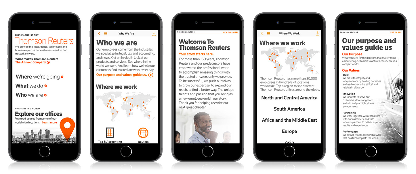
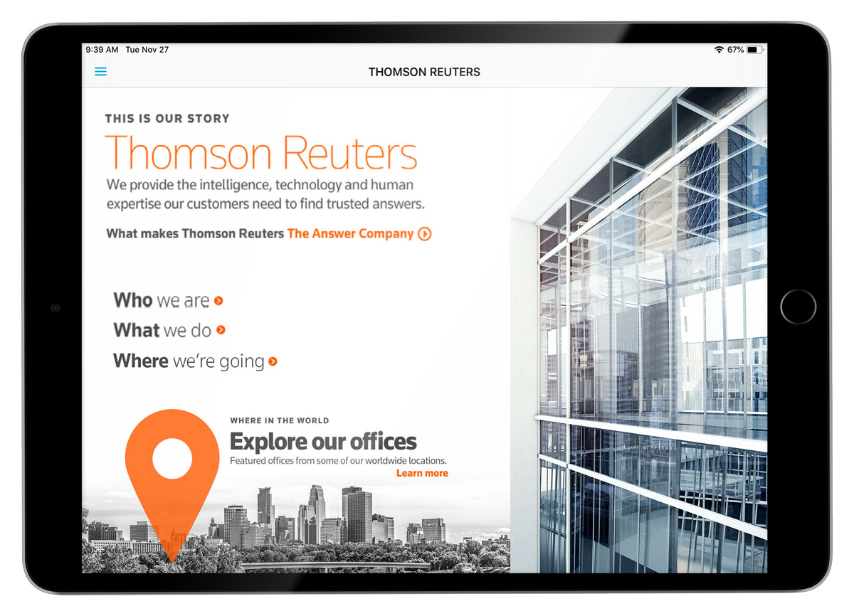
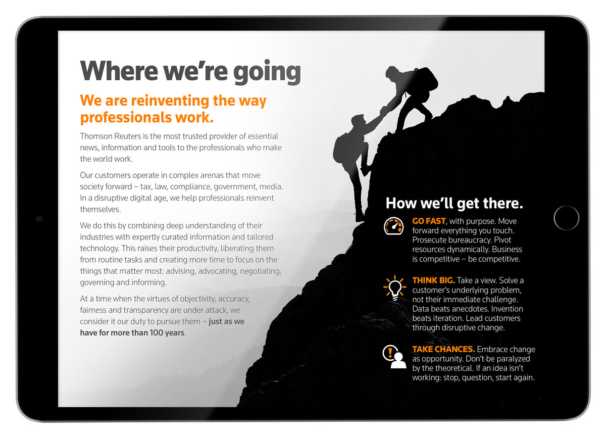
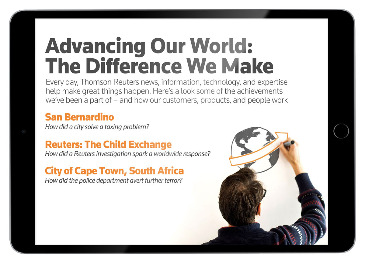
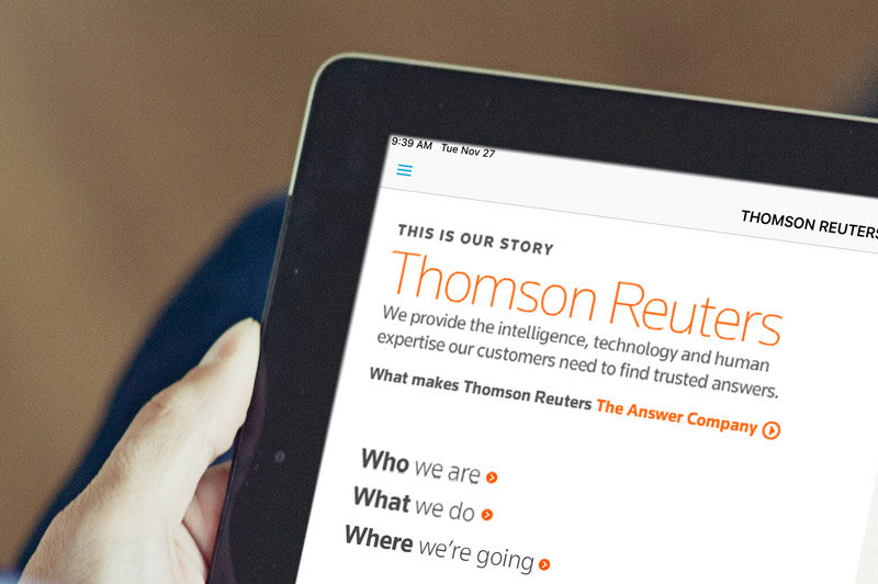
Thomson Reuters is a global corporation that helps professionals across a myriad of industries, but needed help answering the question "What does Thomson Reurters do?"With different divisions and offices across the globe, and operating in different industries it wasn’t a straightforward task. To do the executive board wanted to create an app that would serve as an introduction and general source of information laying out its mission and providing clarity to its employees and customers.
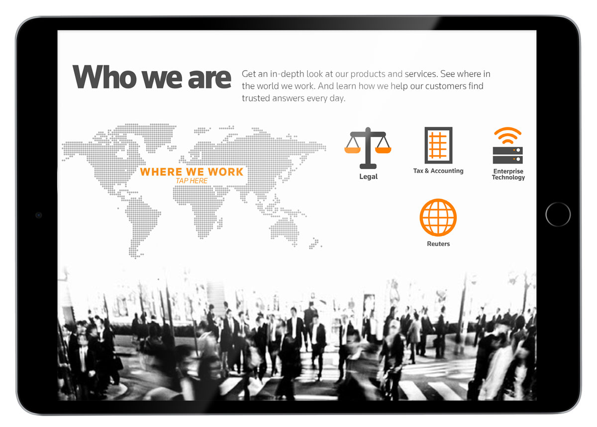
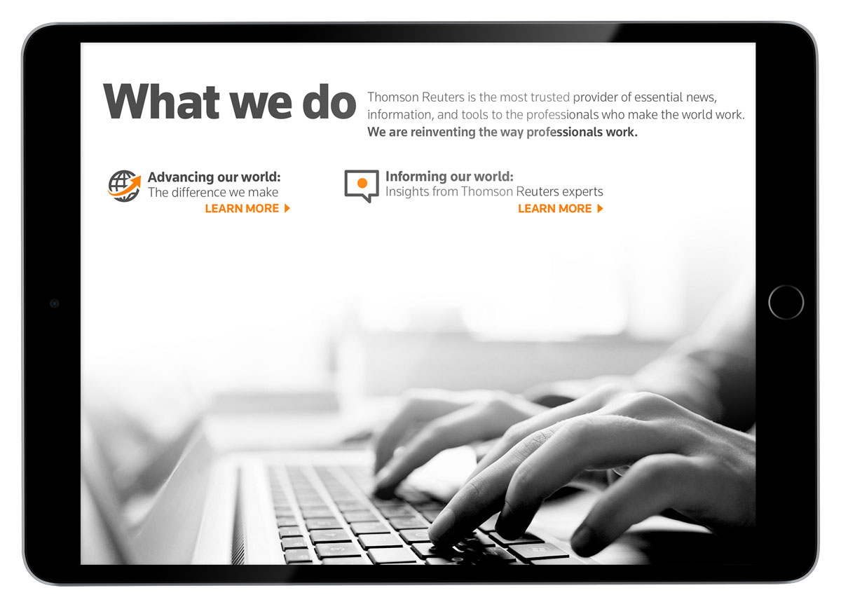
I began by working hand in hand with one of the lead writers and the manager of the creative services division of the marketing group. In order to gather the information we used a “Who”, “What”, “Where” structure, and created an outline from that point. That process provided us not only with the information we were looking for but an underlying structure to guide the UX.
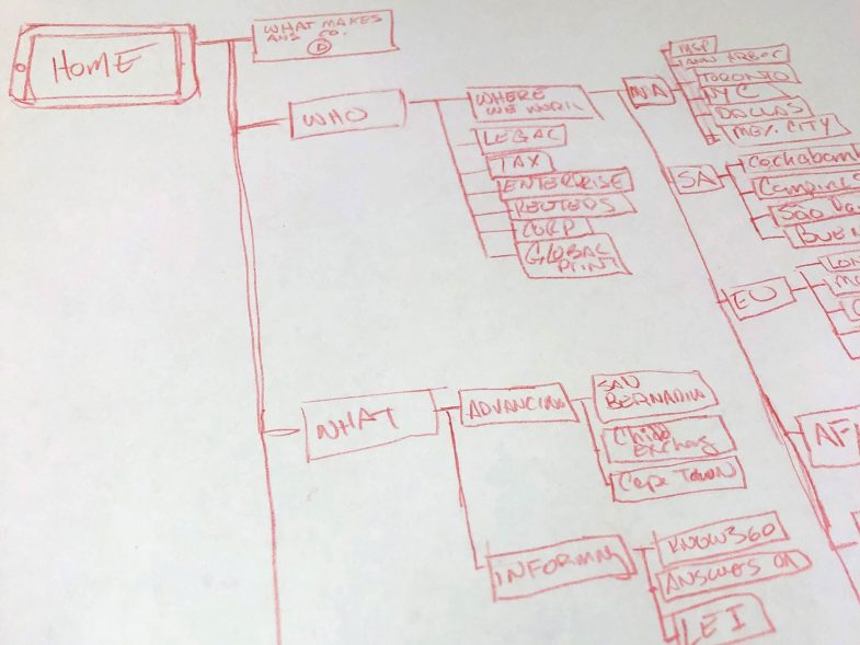
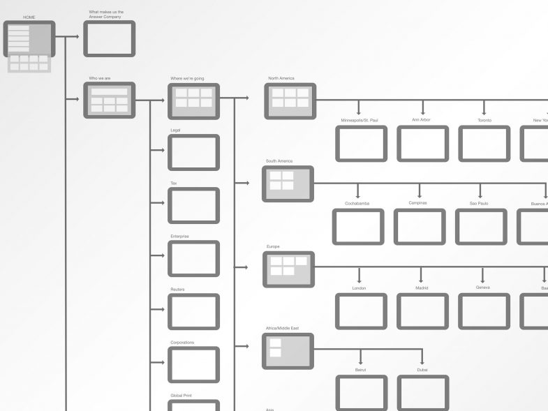
We planned out a set of user journeys based on different personas we imagined would be the main users of the app. I started mapping out a flow and low fidelity screens and made revisions according to the feedback we received from stakeholders and ad hoc user tests. From there I began working in high fidelity concepts. Once we received approval, I worked with a small group of designers to oversee and create the final UI screens and create the app using Adobe Experience Manager Mobile.
The entire process evolved over a year of interviews, iterative designs, and content changes. Working with stakeholders, I used the full suite of Adobe products while incorporating HTML animation and interactive elements. It was so well received that the HR department integrated the app into their onboarding tool for new employees, and helped expand the content provided in subsequent updates.
